Executive Summary
As we pivot away from the high-dopamine brights of the early 2020s and the ubiquity of “Butter Yellow” in 2024, a new, more sophisticated player has entered the chat. Wax Paper Yellow (Coloro 035-88-12) is the defining neutral for Spring/Summer 2026, offering a translucent, calming alternative to stark whites and clinical greys. This article explores why this specific hue is taking over fashion and interiors, supported by data from WGSN, Coloro, and recent runway analytics.
Introduction: The Evolution of “Quiet Luxury” into “Bio-Luminescence”
In the volatile landscape of trend forecasting, few colors manage to bridge the gap between commercial viability and high-concept design. Enter Wax Paper Yellow.
While 2024 and 2025 saw the rise of “Butter Yellow” as a soft pop of color, 2026 marks a shift toward “tinted neutrals”—shades that feel almost barely there but possess a distinct emotional weight. Wax Paper is not a pigment-heavy yellow; it is a texture-driven hue reminiscent of unbleached parchment, diluted winter sunlight, and bio-materials.
According to the WGSN x Coloro S/S 26 forecast, this shade captures a consumer desire for “healing, restoration, and neutrality” in an increasingly polarized world. It is not just a color; it is a visual exhale.
Defining the Shade: What is Wax Paper Yellow?
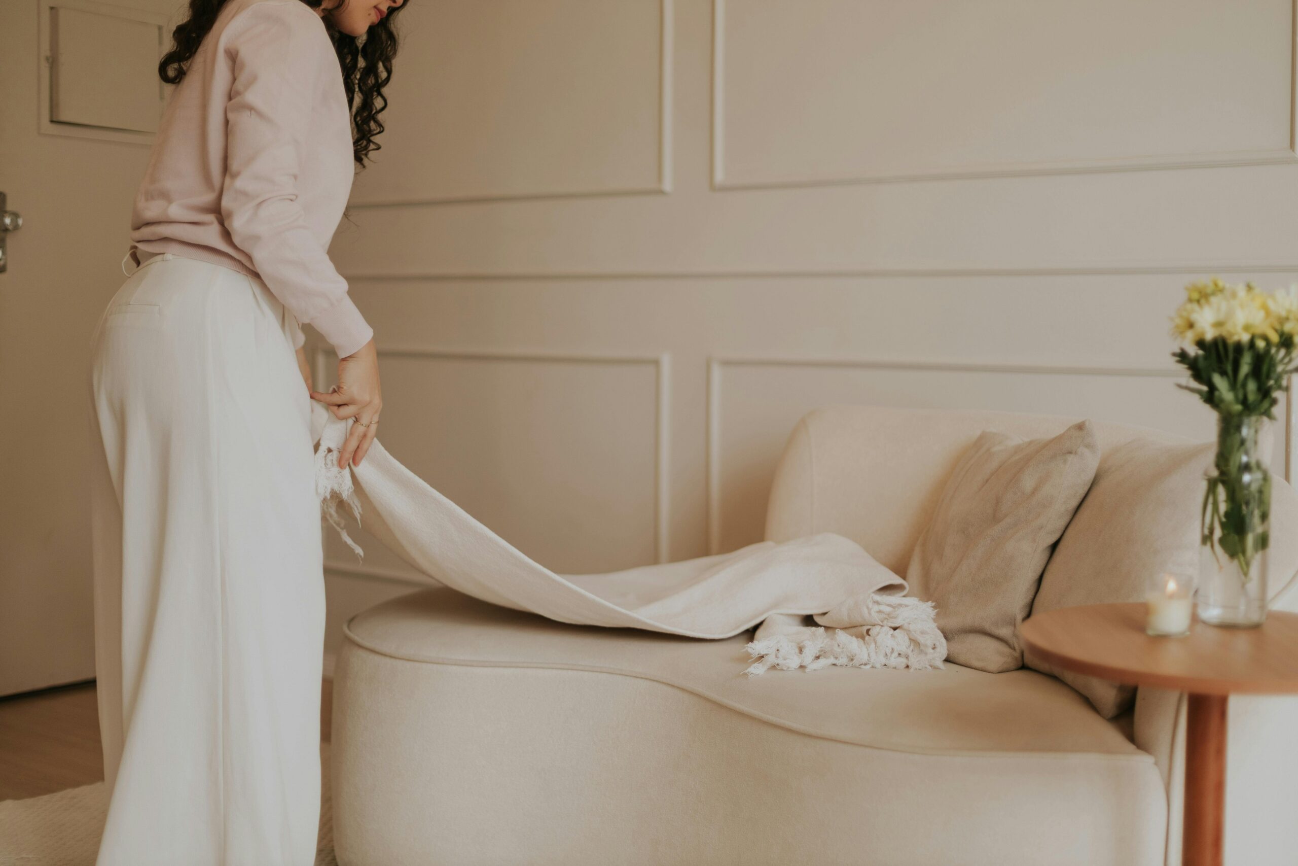
To understand the trend, we must define the pigment. Wax Paper is technically categorized as a near-neutral. It sits precariously between a warm off-white and a pale, desaturated citron.
- Coloro Reference: 035-88-12
- Visual Descriptors: Translucent, creamy, milky, parchment-like, “lit from within.”
- The Vibe: Unlike the sunny optimism of “Gen Z Yellow” (circa 2018), Wax Paper is introspective. It evokes the feeling of sunlight filtering through a linen curtain or the semi-opaque look of soy wax.
Industry Insight: “Wax Paper is a ‘non-color’ color. It appeals to the minimalist consumer who finds pure white too sterile and beige too dated. It feels organic yet futuristic—like a lab-grown material.” — Senior Color Strategist, WGSN
Why This Color? The Psychology of S/S ’26
Data from the past 18 months of consumer sentiment tracking reveals three core drivers pushing this trend to the forefront:
1. The Craving for Calm (Restorative Design)
In an era of “polycrisis” (climate anxiety, digital burnout), consumers are gravitating toward environments and products that soothe the nervous system. Wax Paper mimics the glow of natural light, which is scientifically linked to circadian rhythm regulation and mood stabilization.
2. The “Bio-Synthetic” Aesthetic
Sustainability is no longer just about “earth tones” like mud brown or forest green. The new wave of eco-design focuses on bio-synthetics—materials made from algae, bacteria, or lab-grown silk. These materials often naturally occur in milky, translucent yellow-white hues. Wax Paper creates an aesthetic bridge between nature and technology.
3. Trans-Seasonal Versatility
Retailers love Wax Paper because it has zero “seasonality.” It works as a fresh neutral in Spring/Summer but transitions seamlessly into Autumn/Winter when paired with deeper tones like Cocoa Powder or Transformative Teal.
Market Applications: How to Commercialize the Trend
For brands and designers, the application of Wax Paper differs by industry. Here is the strategic breakdown for S/S ’26:
Fashion & Apparel: The Layering Hero
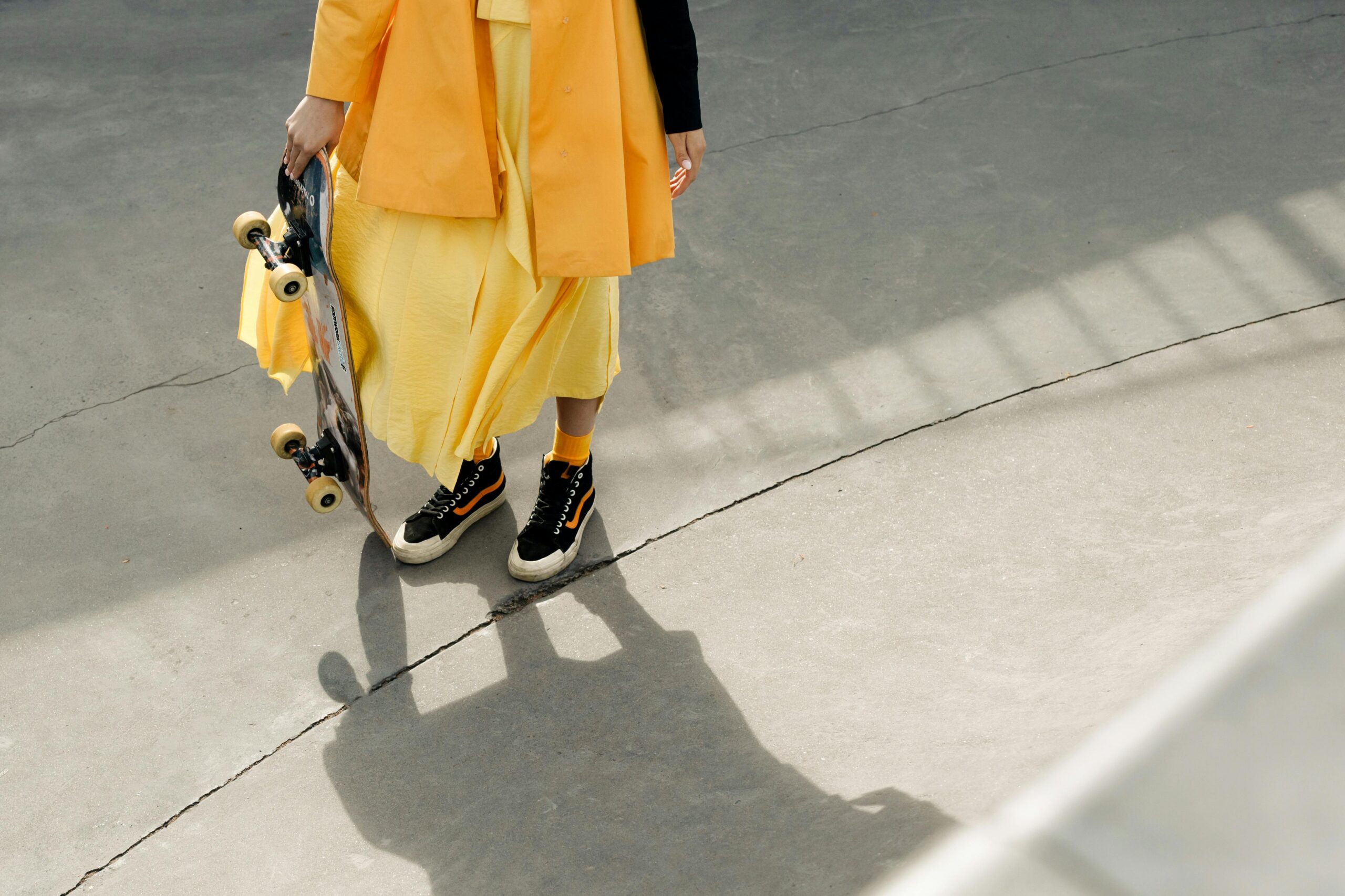
- Sheer Fabrics: The trend is most effective in semi-transparent materials. Think organza, recycled polyester, and fine-gauge knits where the color appears to “float” on the skin.
- Bridal & Occasion: Expect to see Wax Paper replace Ivory as the modern bride’s choice. It photographs with a vintage, cinematic warmth that pure white lacks.
- Men’s Tailoring: A massive opportunity lies in unbleached linen suits. It offers a relaxed, Mediterranean aesthetic that “Butter Yellow” was too feminine to achieve in mass markets.
Interiors & Home Decor: The Wellness Filter
- Lighting Design: This is the most literal and profitable application. Lampshades and glass fixtures in Wax Paper yellow create a “golden hour” effect in living spaces 24/7.
- Wall Treatments: As a paint color, it is being touted as the “New Grey.” It warms up North-facing rooms without turning them garish.
- Tabletop: Ceramic glazes in this hue—often with a crackled or imperfect finish—align with the Wabi-Sabi revival.
Strategic Color Pairings for S/S 26
A color never exists in a vacuum. To maximize the SEO of your collection descriptions and visual merchandising, pair Wax Paper with these trending counterparts:
| Pairing | Vibe | Target Audience |
| Wax Paper + Transformative Teal | Eco-Futurism. The cooling teal balances the warm neutral. High contrast, high impact. | Gen Z & Active Market |
| Wax Paper + Cocoa Powder | Modern Heritage. A rich, sophisticated palette that screams “Old Money” luxury without the logo. | Luxury & Interiors |
| Wax Paper + Electric Fuchsia | Digital Bloom. Using Wax Paper to ground a neon accent prevents the look from feeling juvenile. | Youth Fashion & Tech |
| Wax Paper + Slate Grey | Industrial Soft. Softens the harshness of concrete or steel environments. | Commercial Office Design |
SEO & Content Strategy for Retailers
If you are writing product descriptions or marketing copy for this trend, use the following semantic keywords to capture high-intent search traffic:
- Primary Keywords: Wax Paper Yellow, Color Trends 2026, Spring Summer 2026 Fashion, Warm Neutral Paint.
- Long-Tail Keywords: Translucent yellow fabric, organic minimalist home decor, non-toxic natural dyes, calming bedroom colors 2026.
- Visual Tags: #Coloro0358812 #BioDesign #QuietLuxury #RestorativeColor #WGSN2026
Conclusion: The Future is Translucent
Wax Paper Yellow is more than just a seasonal fad; it is a symptom of a shifting design philosophy. We are moving away from colors that shout (neons, dopamine brights) toward colors that breathe.
For brands, the actionable takeaway is simple: Do not treat this as a yellow. Treat it as a neutral. Swap out your standard whites and creams for Wax Paper to instantly modernize your S/S ’26 assortment with a tint that feels premium, sustainable, and emotionally intelligent.
FAQ: Wax Paper Yellow Trend
Q: Is “Wax Paper” the same as “Butter Yellow”?
A: No. Butter Yellow (popular in 2024) is a saturated, creamy pastel. Wax Paper is more desaturated, translucent, and closer to a beige or off-white. It feels more “natural” and less “confectionary.”
Q: What is the Coloro code for Wax Paper?
A: The specific identifier used by WGSN and Coloro is 035-88-12.
Q: Can I wear Wax Paper yellow if I have cool undertones?
A: Yes! Because it is a “near-neutral” with very low saturation, it doesn’t cast the sickly shadow that bright yellows often do. It acts more like a reflector of light than a pigment.
Q: Is this trend sustainable?
A: Inherently, yes. The color is often achieved in manufacturing by skipping the bleaching process (for cottons and linens), meaning it requires fewer chemicals and less water to produce than stark white fabrics.